Ice Text Effect with CSS
Create a CSS only Ice Text Effect using CSS Gradients and text shadows to create text that looks like its frozen.
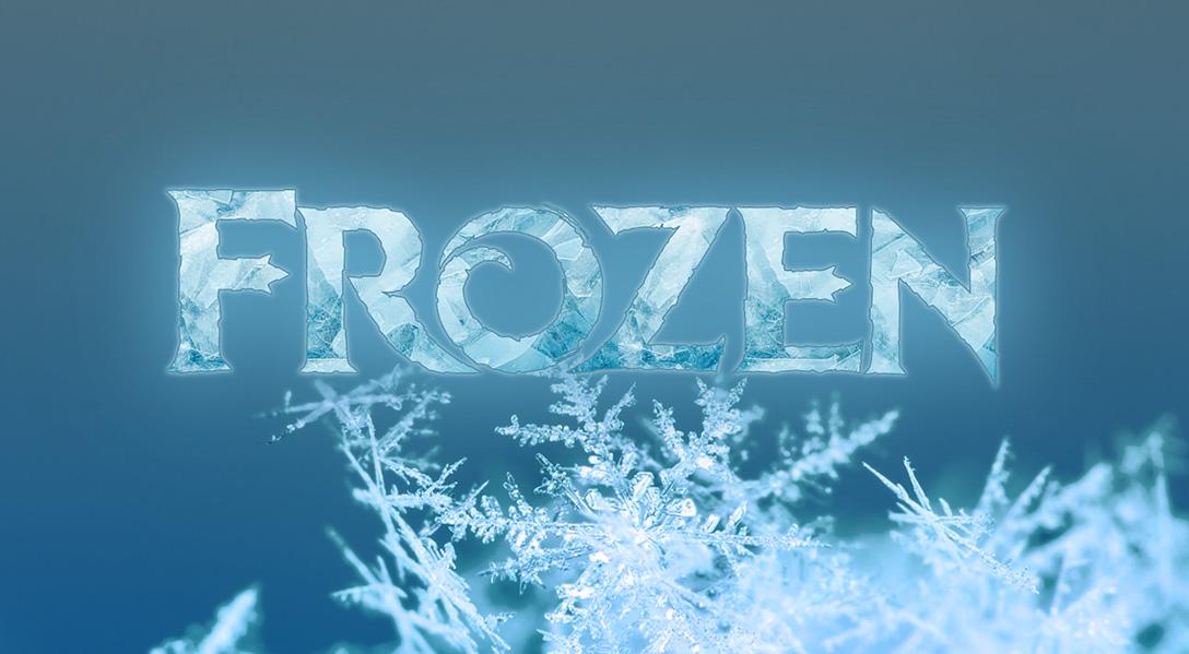
I made this text effect for a talk I was giving to a girls primary school, I wanted to demonstrate ways in which you could utilise web development to create fun things, and of course put your name in your favourite styles.
I'll be using a free font called "Ice Kingdom Bold by Kustren" I don't have a download available but you can search for it yourself if you want the same style. Otherwise you can go to the full screen frozen demo and check it out. If you prefer video tutorials to written ones, you can check out the Ice CSS Text Effect Video on my YouTube Channel.
If you want to skip the explanation you can jump straight to the Freeze Text Codepen and have a play. Or you can check out the full page demo.
Before we set up our HTML, I am going to show two ways of creating this effect, one way includes an animation and one doesn't. The no animation version requires a single HTML element, but if we want to use the animation we'll need to add in some layers. We'll start off by creating the version without an animation.
<h1>Frozen</h1>
As we don't need multiple layers the HTML is very simple, I've used a h1 for the main text but you should use whatever is appropriate for your project.
Next up we set up the CSS, first I'll add in some base text styling, because we are using more of a decorative font the font stack is a little more tricky to align, I've gone with some basic sans-serif fonts but because of the nature of the font nothing is really going to align perfectly.
h1 {
    font-family: "frozen", Helvetica, Impact, sans-serif;
	font-size: calc(20vw + 0.5);
	font-weight: 900;
}
Note: We are using calc for the font-size to ensure the text scales when zooming for accessibility purposes, if you use viewport units only it wont scale.
Once the base text styles are done, we can go ahead and set up the background image. You can use any kind of ice image that you like, the one I have is from iStock. I've also included the background-size property with a value of contain to make sure the image fits the text area, you may or may not want to do this depending on the image you use.
h1 {
  background-image: url("./ice.jpg");
  background-size: contain;
}
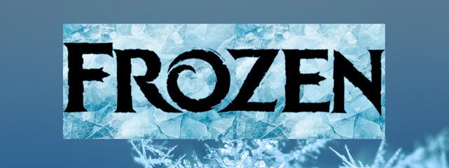
What you'll find at this point is the gradient sits like a rectangle behind the text, like a background! It will look a bit like the following image (this will look familiar if you've seen any of my other tutorials).
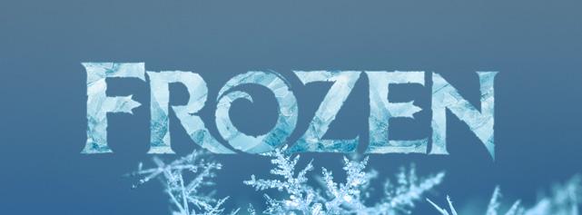
In order to have the gradient actually fill the text instead of the background we need to add two additional CSS properties -webkit-background-clip and -webkit-text-fill-color. The background-clip property is going to clip the background to our text, and the text-fill-color property is going to get rid of the text color so that we can see the background behind it.
h1 {
    background-image: url("./ice.jpg");
    -webkit-background-clip: text;
    -webkit-text-fill-color: transparent;
}
This will create the following image, and it looks pretty good as is, but to make sure it doesn't blend into the background too much I also want to include some outlines and shadows.
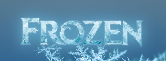
The first thing we want to add is the text-outline property, to outline the text, what I am aiming for is a 1px outline in a colour that is similar to the background image colours but slightly darker to give it some definition. We also don't want it to be too "blue" otherwise it looks a bit off, so i've gone for a muted blue. If you're worried about browser support, it's supported everywhere except IE.
    h1 {
        ...
        -webkit-text-stroke: 1px #4f90ab;
    }
Finally we can add the shadows, as we are not going to be animating this version we'll go ahead and use a filter with the drop-shadow value. Utilising drop-shadow means we don't need multiple layers. (A drop shadow is basically a blurred, offset version of the input image's alpha mask placed below the image). To achieve the look I'm after I'll create multiple drop shadows stacked on top of each other to create a glowing effect - you can adjust this to however suits your needs or use it as is.
h1 {
    ...
	filter:
		drop-shadow(0 0 2px rgba(255,255,255, 0.7))
		drop-shadow(0 0 2px rgba(41, 131, 172, 0.7))
		drop-shadow(0 0 30px rgba(125, 204, 239, 0.8))
		drop-shadow(0 0 30px rgba(58, 122, 155, 0.8));
}
Looking closely at the syntax, it works very similar to text-shadows (if you are familiar with them). Drop shadows are a function that you can use as a value of the filter property, and it allows us to specify length and colour. Two length values work like an offset, so in the case of the code below it is offset horizontally and vertically by 1 pixel (negative values are allowed here as well it will just offset in the opposite direction). If you set 3 length values the third value is called the "standard deviation" it basically means you want to blur the shadow (via a Gaussian blur).
filter: drop-shadow(1px 1px 2px rgba(255,255,255, 0.2))
After implementing the drop-shadow you should now have something that looks like the image below.
If you're happy with the result now you can stop here and you have your complete effect, however my original demo also included an animation that is sort of like a light reflection across the text.
Adding the animation
To add the animation we'll need another layer, so to do that we'll create a copy of the text using a <span> and the aria-hidden attribute to hide it from the accessibility tree. (Read about why we are taking this approach and not using data-attributes and pseudo-elements to create layers on textlab.dev).
<h1>
    Frozen
    <span aria-hidden="frozen">Frozen</span>
</h1>
With this layer we can add our animation styling, you will probably want to do this with a class but for simplicity I'll just style the span directly.
In order to get the span to align with the h1 we first have to add the position: absolute; so that it is taken out of the flow and stacked on top. Now that the element is positioned absolutely we can add left: 0; to ensure it aligns perfectly with the original text. Depending on how you have set your text up you might need some more alignment e.g. top: 0; but that will depend on your setup. Keep in mind it is easier to align the text when they are nested than it is when they are sibling elements.
span {
    position: absolute;
    left: 0;
}
When you add a new layer you might find that you need to add some positioning and a z-index onto the h1 in order to get everything align, but this will depend on your setup. You can check out the full codepen to see the code in action, it includes the no animation and animation examples you can comment and uncomment the code to have a play around.
h1 {
    position: relative;
    z-index: 1;
}
Once we have the alignment perfect we can add the actual animation effect. First up we want to add in a linear background gradient, this will give us the "light reflection" we want to animate. We'll also add in the background-clip and text-fill-color properties. Finally we include a background-size to have to expand greater than the actual text area - this will make sure it doesn't have any weird cut off bits.
span {
    ...
    background: linear-gradient(
        45deg,
        rgba(255, 255, 255, 0) 45%,
        rgba(255, 255, 255, 0.8) 50%,
        rgba(255, 255, 255, 0) 55%,
        rgba(255, 255, 255, 0) 100%
    );
    -webkit-background-clip: text;
    -webkit-text-fill-color: transparent;
    background-size: 200%;
}
All that is left is to include the movement using the keyframes at-rule. I've called it "shine" and then changed the position of the background so it will appear to move across the text. The actual "moving" part is done with the 0% and 10% keyframes, the 10%-100% is a artificial pause in the animation so that it doesn't loop over and over really fast. We'll also add the animation property to the span referencing our keyframes, I've set it to 7s and infinite so it will loop.
span {
    animation: shine 7s infinite;
}

@keyframes shine {
    0% {
        background-position: -120%;
    }
    10% {
        background-position: 120%;
    }
    100% {
        background-position: 120%;
    }
}
At the start of the post I mentioned earlier that there were two ways you could build this depending on the use of animation. One thing to keep in mind is that adding an animation and a drop shadow can really impact your performance.
Using text-shadow instead of drop-shadow for performance improvements
This is optional, but if you find yourself having performance issues with the drop shadow/animation combination you can replace the drop shadow with a text-shadow, but to do that we'll need another layer. First you'll need to delete the drop shadow and set up an additional layer. The main difference is the use of the text-shadow property on the first copy rather than drop-shadow on the h1, and secondly on the copy i've included the mix-blend-mode property with a value of hard-light to ensure the text shadow doesn't block the background image effect.
    <h1>
        Frozen
        <span class="copy1" aria-hidden="true">Frozen</span>
        <span class="copy2" aria-hidden="true">Frozen</span>
    </h1>
h1 {
    font-family: "frozen", Helvetica, Impact, sans-serif;
	font-size: calc(20vw + 0.5);
	font-weight: 900;
	background-image: url("ice.jpg");
	-webkit-background-clip: text;
    -webkit-text-fill-color: transparent;
	background-size: contain;
	position: relative;
	-webkit-text-stroke: 1px #4f90ab;
    position: relative;
    z-index: 1;
}

.copy1 {
    position: absolute;
    left: 0;
    text-shadow: 1px -1px 2px rgba(#fff, 0.2), 1px -1px 2px rgba(#fff, 0.2),
        -1px -1px 2px rgba(#fff, 0.2), 2px 2px 2px rgba(#2983ac, 0.2),
        -2px 2px 2px rgba(#2983ac, 0.2), -2px -2px 2px rgba(#2983ac, 0.2),
        3px 3px 30px rgba(#7dccef, 0.5), -3px 3px 30px rgba(#7dccef, 0.5),
        -3px -3px 30px rgba(#7dccef, 0.5), -6px 6px 30px rgba(#3a7a9b, 0.5),
        6px 6px 30px rgba(#3a7a9b, 0.5), -6px -6px 30px rgba(#3a7a9b, 0.5);
    -webkit-background-clip: text;
    -webkit-text-fill-color: transparent;
    mix-blend-mode: hard-light;
}

.copy2 {
    /* animation styles */
}
This will give you text that hopefully looks like the image below. In order to create my demo I've added in some positioning which you can check out in the Codepen example. If you don't need the animation the drop-shadow version is a lot better as it only requires one html element, however if you want to do something a bit fancy or you're finding some performance problems happening you know you have the text-shadow option with layers to fall back on.
You can find all the code for the Ice Text on Codepen you'll notice it has commented out code, that includes the options for animation and text shadow as well. Or you can check out the editable full page demo and take some screen shots.