Gold Text Effect with CSS
Create a CSS only Gold Text Effect using CSS Gradients and text shadows.

Playfair Display by Claus Eggers Sørensen is Free
Code by Mandy Michael available on Codepen
Replicating the look of "gold" in anything can be quite tricky and often it comes out looking a bit subdued. However, I came across this Gold Text Effect in PhotoShop by Fabio Sasso and I felt like they really nailed the gradient. So I decided to give it a try and see if I could replicate it in CSS. If you prefer video tutorials to written ones, you can check out the Gold CSS Text Effect Video on YouTube.
I'll be using Playfair Display available on Google Fonts for this demo. It's free to use so you can go ahead and use that as well if you want. Otherwise I find, Times New Roman is also a good choice, basically I think it looks best with any kind of serif font with sharp lines.
If you want to skip the explanation you can jump straight to the Gold Text Codepen and have a play. Or you can check out the full page gold text demo or if you're curious about other versions I've also made a silver demo on Codepen. You can view the full page silver demo as well.
First we want to set up our HTML, in order to replicate this we are going to need two layers of text, which means we have to duplicate the text itself. In the original version of this demo (and you might still see this in some of my Codepen demos) I used a data-attribute for creating the copy. The reason I don't do this anymore is because it causes some issues for screen readers, specifically it reads the text out multiple times, which is super annoying. If you want more information on this I wrote a post called The problem with data-attributes for text effects about it which goes into more detail over at Text Lab. For this demo, so that it doesn't annoy people using screen readers we'll duplicate the text and use aria-hidden to prevent it from being announced.
<h1>Winner</h1>
<span class="text copy" aria-hidden="true">Winner</h1>
I've used a h1 for the main text but you should use whatever is appropriate for your project, for the copy I've used a span but it doesn't really matter too much as this is just a copy and we're telling assistive technology to ignore it.
Next up we set up the CSS, first I'll add in some base text styling that we'll apply to both the h1 and the copy. I recommend you do this with a class, I've kept it as the element for simplicity.
h1, span {
    text-transform: uppercase;
    margin: 0;
    font-weight: 400;
    font-size: 18vw;
    font-family: "Playfair Display";
}
Note: I have used vw units for the font-size so that the demo will easily scale but still be simple. However I would not recommend doing this in your project as it will prevent users from being able to increase the size of text by zooming in or out. Instead, use it with a relative unit. e.g. font-size: calc(18vw + .5rem);.
Once the base text styles are set up, we can go ahead and start on the gradient for the main effect. I used the gradient that Fabio setup in their tutorial as a guide, and manually colour picked some of the points then adjusted them slightly in the browser via dev tools. For our purposes the following code snippet is the gradient I ended up with. If Gold Text isn't your thing you can check out the silver version which was made by reducing the saturation of the colour which some slight adjustments.
h1 {
   background: linear-gradient(to bottom, #cfc09f 27%, #ffecb3 40%, #3a2c0f 78%)
}
What you'll find at this point is the gradient sits like a rectangle behind the text, like a background! It will look a bit like this.

In order to have the gradient actually fill the text instead of the background we need to add two additional CSS properties -webkit-background-clip and -webkit-text-fill-color. The background-clip property is going to clip the background to our text, and the text-fill-color property is going to get rid of the text color so that we can see the background behind it.
h1 {
    background: linear-gradient(to bottom, #cfc09f 27%, #ffecb3 40%, #3a2c0f 78%);
    -webkit-background-clip: text;
    -webkit-text-fill-color: transparent;
}
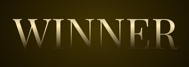
This will create the initial layer which will look like the following image. It looks pretty good as is, but in order for it to look more "gold" like it needs more definition, so to do that we'll start styling the second layer and utilise some CSS text shadows.
This next part is optional but if you want to have a little bit more depth you can have a more complex shadow like the original tutorial. But you'll need to use background-position to align it to match your text.
    h1 {
        background: linear-gradient(to bottom, #cfc09f 22%,#634f2c 24%, #cfc09f 26%, #cfc09f 27%,#ffecb3 40%,#3a2c0f 78%);
	    background-position: 0 1vw;
    }
I prefer the simpler version because it works better with rounded glyphs, but I thought I'd provide it as an option as it can add a nice depth if your text is more square. You can see it in play in the Silver version.
Now we have to deal with the positioning of the layers so that the second layer sits underneath the first layer. I've done this by setting the span to position:absolute (and because it's a span I've set it to display:block if you use a block element you won't need to do this). On the h1 we will need to set a z-index:1 and a position of relative. Depending on how you set up your HTML this combination could be a little different. But the end goal is to have the copy layer sitting below the main layer. Sometimes I find nesting the second layer inside the first layer makes this a little easier, but it's really up to you how you choose to structure things.
h1 {
    ...
    position: relative;
    z-index: 1;
}

span {
    position: absolute;
    display: block;
}
Once you've done this the text should be sitting behind the main text, and not be visible to you. So it should look like the previous image. Once that is done we can add the text shadow to the copy layer. The text shadow is going to add a highlight to the left edge of the text, and a dark blur to "elevate" it off the page a little for depth.
span {
    text-shadow:
        -1px 0 1px #c6bb9f,
        0 1px 1px #c6bb9f,
        5px 5px 10px rgba(0, 0, 0, 0.4),
        -5px -5px 10px rgba(0, 0, 0, 0.4);
    position: absolute;
    display: block;
}
This will give you text that hopefully looks like the image below. In order to create my demo I've added in some positioning which you can check out in the Codepen example. I also added the radial background gradient because it was in the photoshop tutorial and I thought it looked cool.

If you're interested in what the silver version might look like, I also made a demo of that.

Enjoy!